— FIELD & SCREEN —
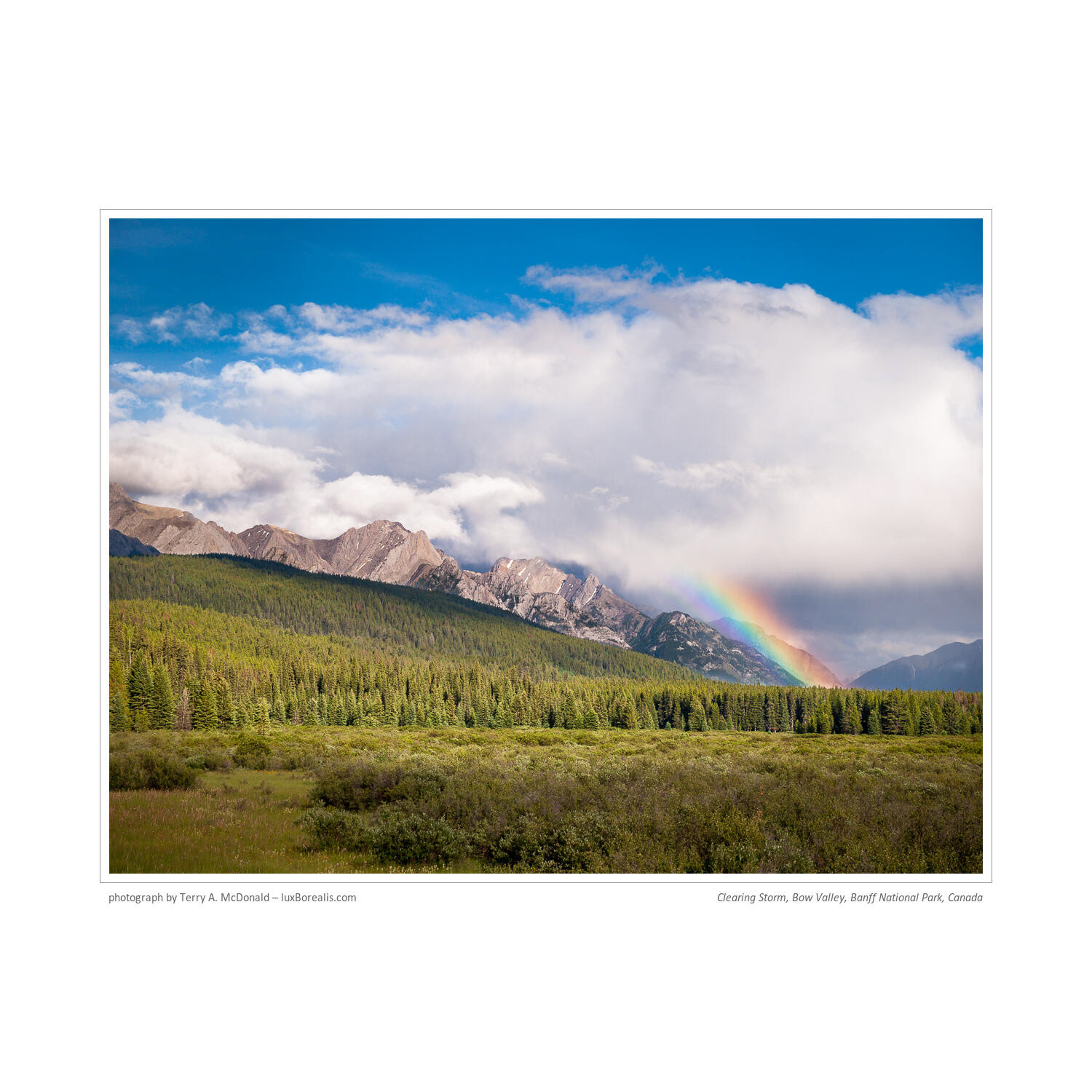
Clearing Storm, Bow River, Banff National Park, Canada
Article: June 2024; Original capture: July 2011
— Note: Select any photo to begin scrolling through them in Light Box mode. —
Clearing Storm, Bow River, Banff
I'm upset with myself for beginning this project with a photo from Banff National Park. It’s a beautiful place, but due to its spectacular beauty, Banff is over-run with tourists. And that creates a vicious cycle: spectacular beauty = great photos = tourists = Instagram moments = more tourists—and now I’m contributing to it! That said, it’s hard not to get a great photo in Banff, or Yoho, or Kootenay or Kananaskis or Jasper or Canmore or . . . Hey—it's the Rocky Mountains, so, yes, it's very photogenic!
FIELD: Ambient Conditions—Evening 'Game' Drive!
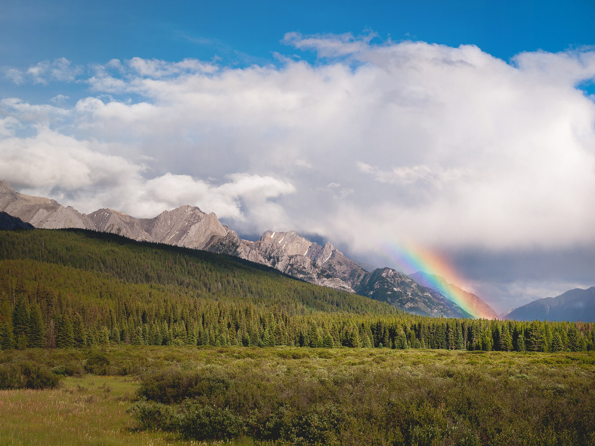
This photo was made at 6:58pm on 20 July. We were on our way north from Johnston's Canyon Campground to Morant's Curve—the renowned location for the nexus of the Bow River, the CP Rail track and the spectacular mountains behind. The timing of this photo is an important consideration.
For one, it is in the early evening, when most people are having dinner or just finishing. This means there are fewer cars and tourists around. It's still busy, but not as busy as the last few of hours of afternoon. Our family often goes on 'evening game drives', a habit we picked up while living in Tanzania and one that has proven to be very rewarding over the years, virtually everywhere we've travelled, both for photography and for family wow-moments.
Furthermore, evening is well-known in landscape photography circles—the lower sun angle provides warmer colours and longer shadows, which contribute to more dramatic scenes.. Yes, you must work quickly to make best use of the light, but the images are far more rewarding. Add in a passing thunderstorm and a rainbow . . .
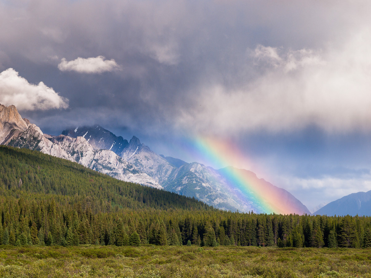
This was my initial view. I knew I needed to move to get rid of the barrier created by the foreground trees..
FIELD: Aesthetic Elements & Composition
When my wife and I are in the car and a scene like this is developing, she knows right away what I'm looking for—a foreground. At the same time, I'm looking for leading lines. A strong foreground element helps to anchor the scene, provide context, and an invitation into the scene. The leading lines then draw the viewer into, through and around the photo.
You see, compositions don't just happen—photographers must work to assemble the necessary elements of a scene into a composition that flows. And, guess what, it takes work: moving around the scene plus a good dose of perception. As I move around a scene assembling the foreground and leading lines, I am thinking about what the scene will look like at various focal lengths. Sometimes, I will hold up a viewing card; other times I hold up my hands in a rectangle like a Hollywood movie director; rarely will I use my camera. Get the camera away from your face so you can see the whole scene!
100mm (efov), ƒ11 @ 1/60; ISO 100; EV+1; raw image processed in Lightroom
My initial thought was a narrow view, in this case at 100mm, but it felt a bit restrictive considering everything that was going on around me.
As I am composing, I am also thinking about how to fit the scene to the aspect ratio of my camera (4:3, 2:3, etc.), how it fits the Rule of Thirds (yes, it works!) and how it fits my Rule of Threes, which involves the interplay between the foreground, mid-ground and background. I also want to fill the frame making best use of every pixel from left to right, bottom to top and corner to corner, so I crop with my feet, moving closer or further, if possible, but also gauging that against the perspective I want to achieve.
When I want more foreground or more sky—rarely equal—I choose a wider perspective. When I want to accentuate the background, I choose a telephoto perspective. My job is to determine where the balance point is between the two and that will determine my focal length. Typically I start wide (16mm, 20mm, 24mm) as I like to provide the ‘essence of place’, a.k.a. context. If that's not working in a composition, I consider narrower views provided by 35mm, 50mm, even 80mm.
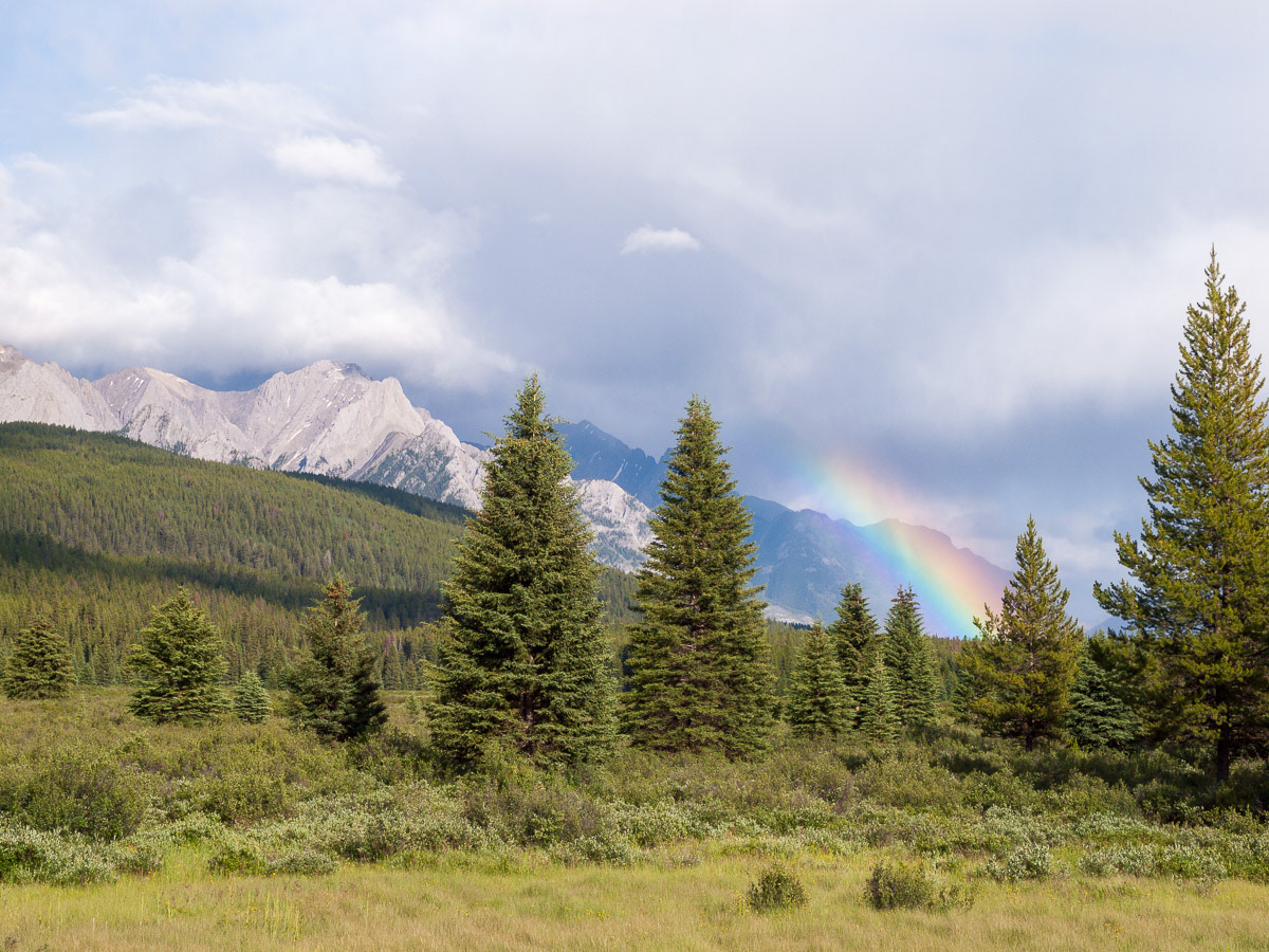
Almost there. I’m in about the right position, but it’s still flat-looking without something in the foreground to invite the viewer in,
Back in the field, even to this point, I have not put the camera up to my face. I am visually scanning the scene, examining each potential element, to ensure I'm not missing anything. This may only take a matter of seconds, but can take a few minutes, or longer, if I have the time or if I really need to work at it. In the case of a quickly-moving thunderstorm, time was not on my side.
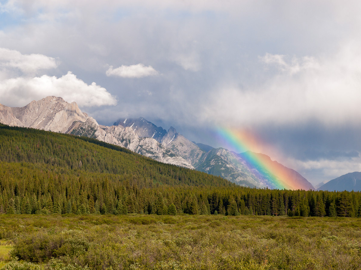
Initially, I made some exposures at 100mm, then decided to back up a bit. Having moved back, I was still missing a foreground ‘invitation’.
65mm (efov); ƒ8 @ 1/160; ISO 100; EV+⅔
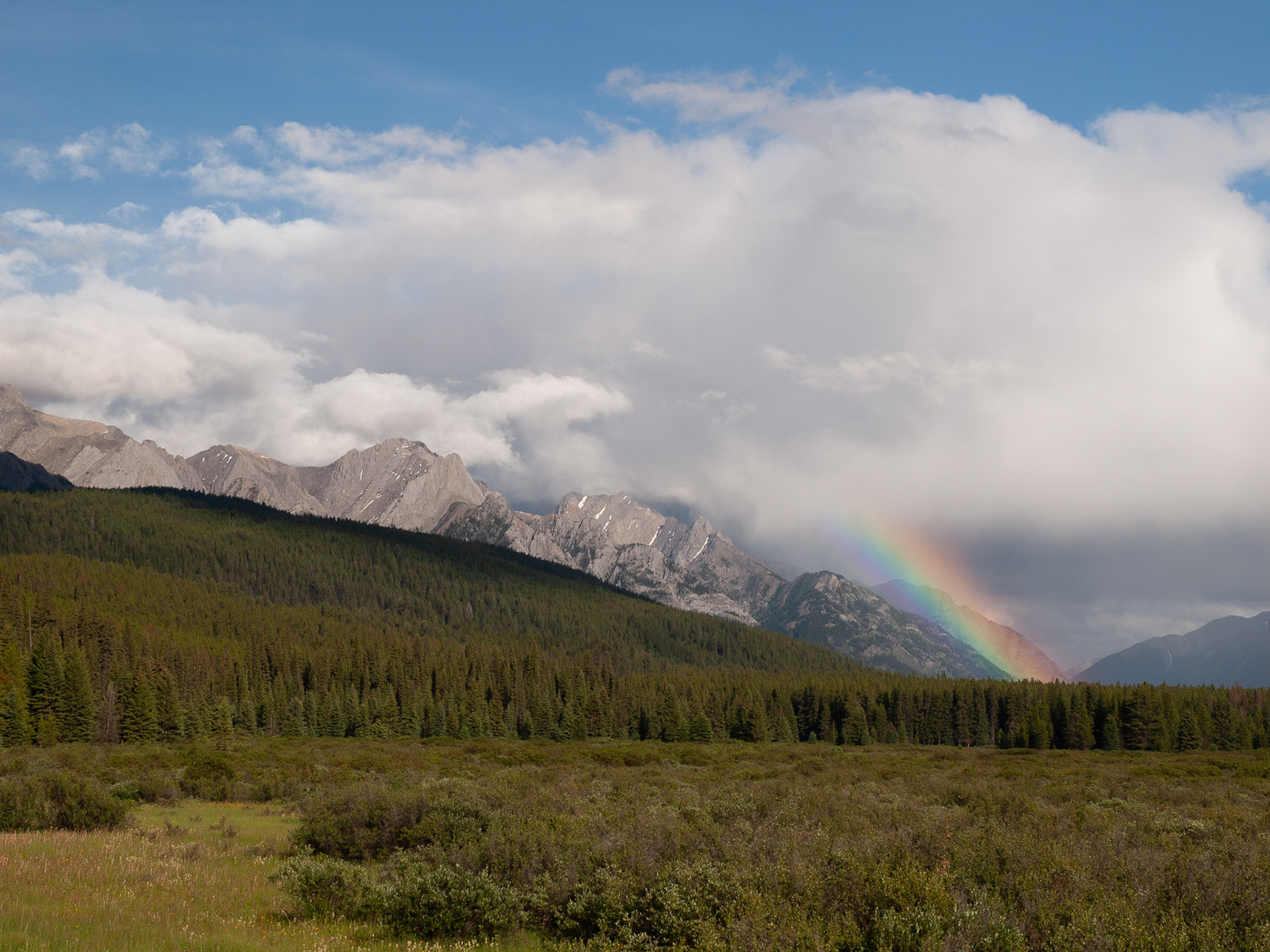
The raw file directly from the camera. It has all the pixel-level data I need, but it needs some spit and polish.
Capturing a JPEG is a bit of a dead-end as it is stripped of additional colour information, sharpened, then compressed, losing pixel-level data. It looks great on a computer and could be printed as is, but there is so much more potential in a raw image file, not only for processing now, but also with future improvements in raw processing engines and additional options in image editing suites.
This shot, made in 2011, was much grittier-looking with earlier raw processing engines. It looked great against the standards back then, but it looks even better today—something that is not possible if I had originally saved it as a JPEG.
Finally, I zoomed to 65mm, providing a wider field of view to retain the line of mountains leading from the left to the rainbow. As well, I could incorporate the small area of meadow in the bottom left to invite the viewer into the scene, creating a greater feeling of three-dimensionality than the narrower view at 100mm.
FIELD: Technical Controls
Once the composition is set, it's time to (a) put the camera on a tripod or (b) handhold and hope for the best. Choosing (a) or (b), along with any movement caused by wind, determines your shutter speed in tandem with the aperture.
In this case aperture was pretty straightforward. In fact, most landscapes are fairly straightforward—a small enough aperture to provide enough depth-of-field to cover foreground to background at a high enough shutter speed to freeze whatever motion is happening.
Regarding ISO, for landscapes I do not, absolutely do not use auto ISO. I working with only the optimal ISO for the camera being used, which, in this case was ISO 100. Optimal ISO provides the greatest dynamic range and the least amount of noise. With higher ISOs, noise can be reduced in post-processing, but you can never recover dynamic range.
An aperture of ƒ8 covered the depth-of-field needed and happens to be the sharpest aperture for lens I used. NOTE: Given the same perspective, ƒ8 in Micro Four Thirds provides equivalent depth-of-field to ƒ16 in full frame. ƒ8 gave a shutter speed of 1/250.
From here, I check for 'blinking highlights' which indicate if the highlights are too bright. Overexposed highlights mean they will be pure white without any detail—not at all what I want! In this case, the highlights were underexposed and could be raised slightly, in fact by ⅔ of a stop, so I dialled in +⅔ exposure compensation. Choosing +1 caused blinking highlights’, so +⅔ was ideal and only reduced the shutter speed to 1/160.
The whole goal of proper Field Techniques is threefold: to nail down a well-composed image that fills the frame and is correctly exposed, especially for the highlights. ƒ8 at 1/160 allowed me to hand-hold the camera while maintaining an optimal ISO of 100. If I had been using full frame at an aperture of ƒ16, the shutter speed would drop to 1/40, jeopardizing the crispness of the image due to movement of the trees by the wind or handholding. Modern stabilisation is often good enough to cover that, but 1/40 may still warrant a tripod.
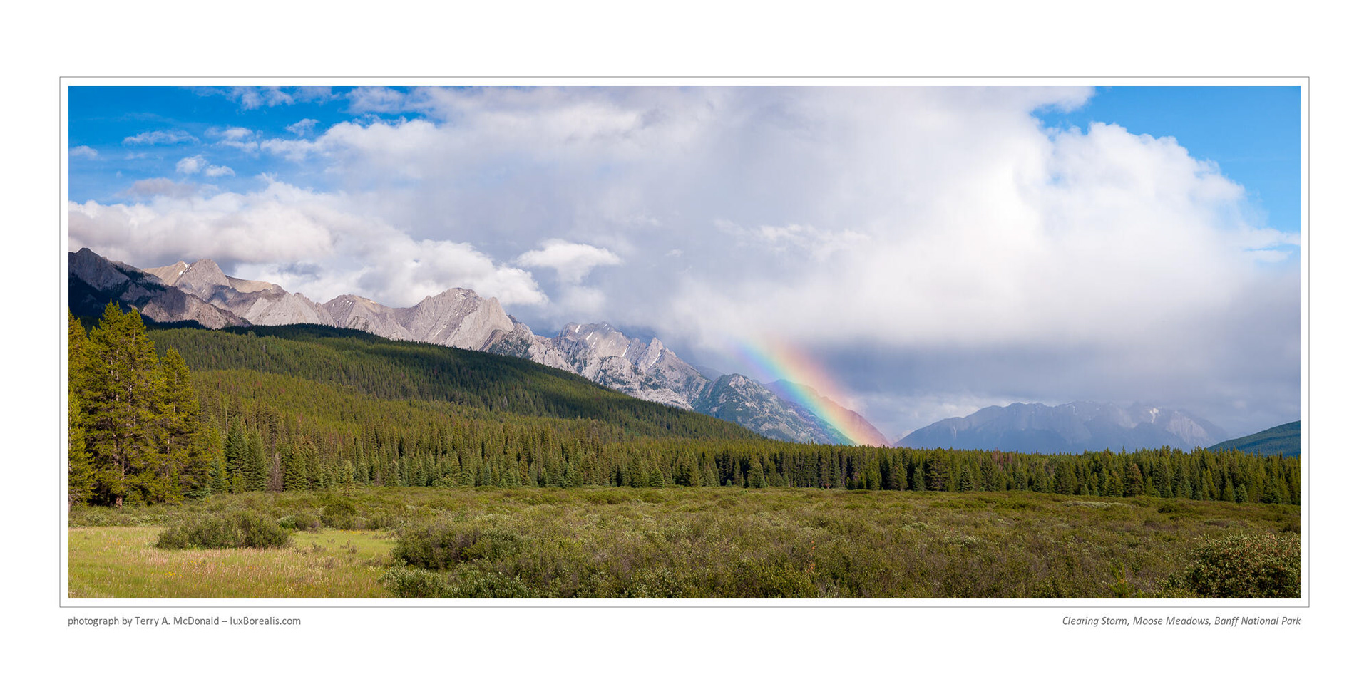
4-frame Panoramic Merged in Lightroom Classic
Whenever possible, take advantage of unique and compelling scenes by shooting horizontals (landscape orientation), verticals (portrait orientation) and, if the scene fits, a panoramic.
FIELD: Working the Scene
Once I made my initial image, and with the light still in my favour, I begin 'WorkIng the Scene'. With dramatic light and clouds that could change at any moment, I want to shoot fast, but shoot thoughtfully. In this case, I captured a 4-image panorama. I changed camera orientation to vertical / portrait, zoomed in about 1.4x the original (in this case about 100mm) and captured each frame by pivoting, being sure to overlap each frame by 20% to 30%.
From my first exposure to my last, when the light simply evaporated (the sun became obscured by cloud), it was a total of 5 minutes. I should have composed and captured a vertical of the scene, which would have completed my work—magazine covers are vertical!—but didn’t. Oh well. that happens. Yes, a vertical could be extracted from the Panorama (since it was shot vertically), but without the blue sky above, it seems somehow incomplete and definitely not as visually compelling as the original horizontal shot or the panoramic.
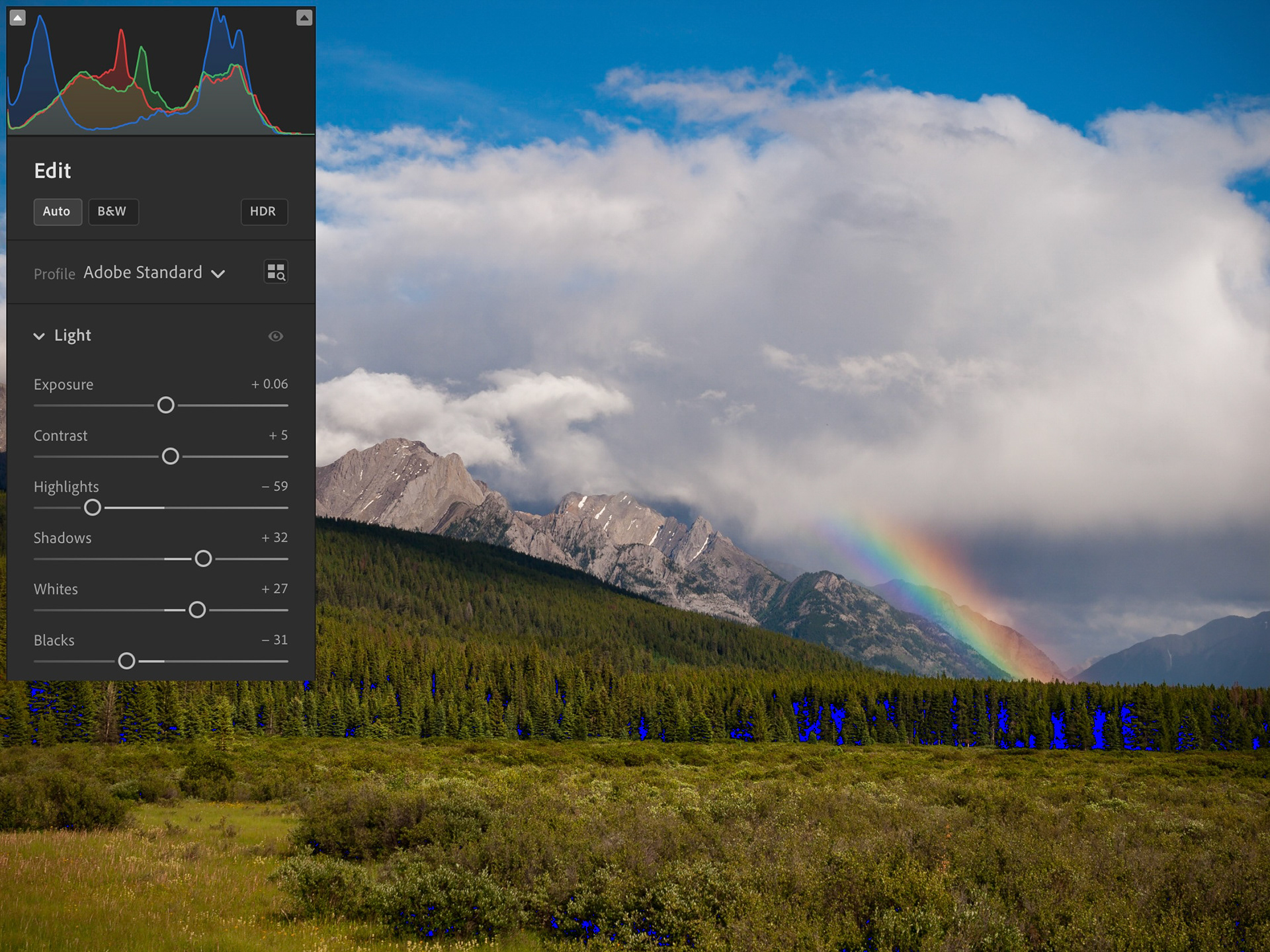
Initial glimpse using Edit > AUTO
SCREEN: Post-capture Processing > Initial Auto
Opening the raw file in Lightroom CC*, I kept the Standard Adobe Profile and selected Edit > AUTO. I do this not to get a perfect result, but rather to see the base level of editing the Black Point and the White Point nailed down. This is essential for all full-tone images, the kind where you want pure black and pure white somewhere in the image, plus all the tones between. Without a correct Black Point and White Point, you are not taking full advantage of the pixel information captured, leaving viewers with a muddy image. Interestingly, this is what the AUTO setting did because it did not accurately nail down the White Point. The Black Point shows up during editing as blue areas in the shadows. But there is no red in the highlights, nor does the histogram show anything in the highlight area.
* Back in 2011, when this photograph was made, I used Lightroom 3, now Lightroom Classic, which provided an excellent result. However, with newer process versions (v2 in 2011, v6 as of 2023), the image is improved. I still use Lightroom Classic for adding borders, margins and titles; and for printing, but even that is gradually changing.
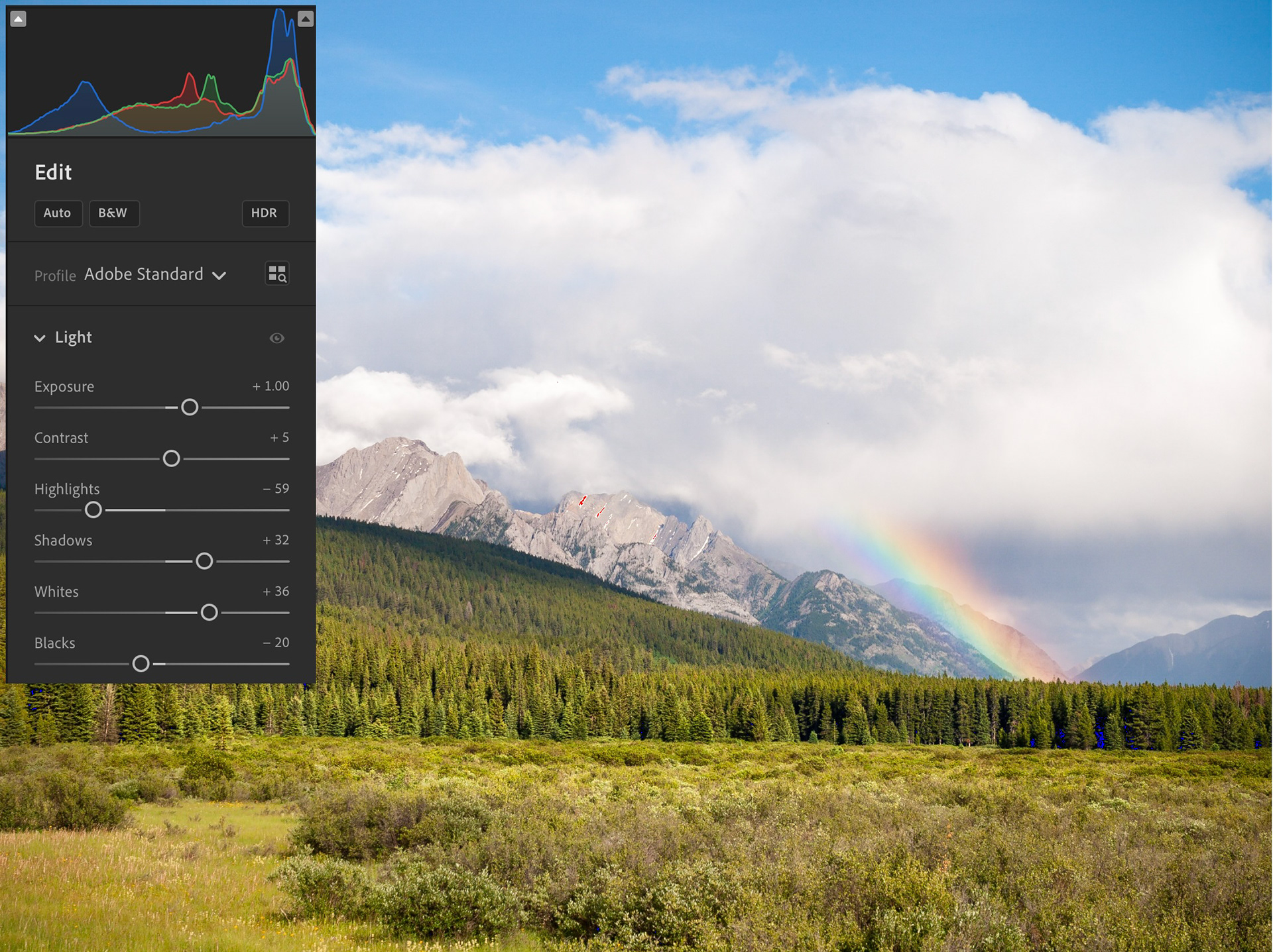
Initial Processing to nail down Exposure, White Point and Black Point
SCREEN: Initial Processing
Now we're getting somewhere. I did three things here to improve the overall exposure:
A. I raised the Exposure by 0.10 at a time, ending at 1.0. I actually went past 1.0 to 1.2 and found that was too bright.
B. I used Auto Whites (hold Shift and click on Whites) to set a more accurate White Point.
C. I used Auto Blacks in the same way to reset the Black Point more accurately.
For Colour > White Balance, I left it "As Shot" which was 5500°. Normally, I prefer a cooler 5100°, but this was early evening and I wanted the colour balance to reflect that. However, I raised the Tint from +3 to +8 to achieve slightly more neutral greys in the clouds.
As this was a distant subject, I also raised Dehaze (under Effects) to 20, providing an overall richer tone.
Under Detail, I applied standard (for this camera, an Olympus E-30) 'Process' Sharpening of 50 with a Sharpening Mask of 35. Sharpening is not a one-size-fits-all adjustment. It varies significantly with camera and subject. NOTE: This 'Process' sharpening differs from 'Output" Sharpening, which is applied when the image is exported as a JPEG or printed, both of which demand different levels of sharpening.
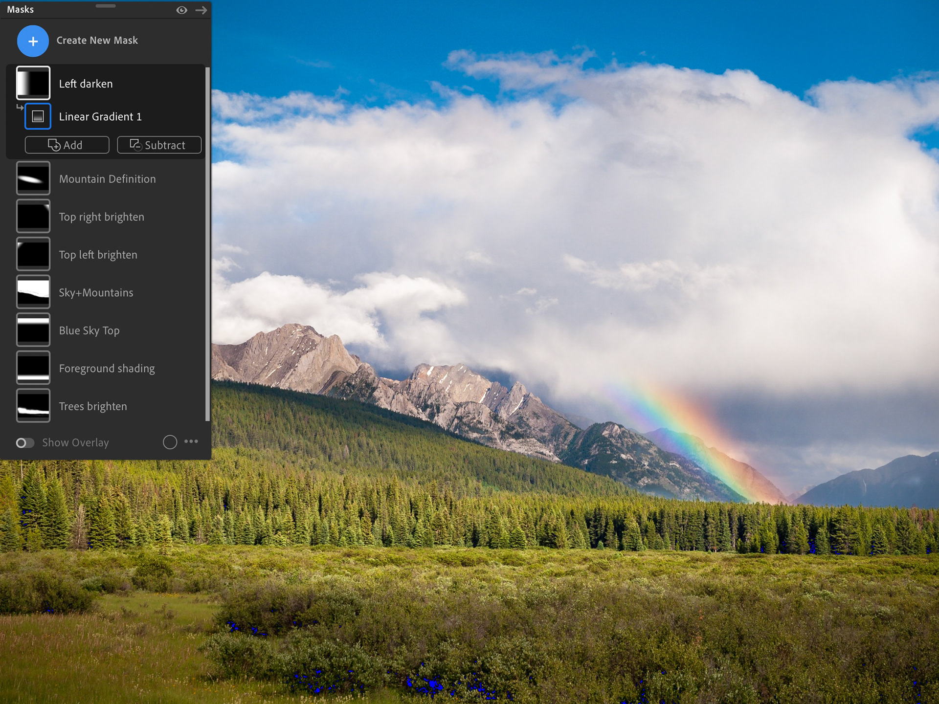
Shaping the image with Masks
My job, as a photographer, is impart three-dimensionality to a two-dimensional image. One way to achieve this is with masks. Compare the previous image (without masks) to this one—we go from flat to three dimensional. With the careful use of masks, this image takes on a three-dimensionality the previous image does not have.
A common question I’m asked is, “How do you know what to do?” There is no easy answer. I try to let the image tell me. If an area looks too light or too dark or too washed out or too contrasty, I use a mask to improve it. If it works, great. If not,I asses ‘why not?’ and try something different. When you do this enough times, you build a repertoire of techniques. Start simple, then try more complex techniques, but try to stay true to the original scene.
SCREEN: Shaping the image with Masks
This is where Lightroom triumphs over apps like Google Photos and Apple Photos. Being able to control portions of the image is essential. It's like Burning and Dodging prints in the darkroom, but on steroids. At this point, some photographers might move to Photoshop and add Layers. I've never found this to be necessary as the control built into Lightroom using masks is substantial (and always improving). In this case, I added the following masks:
A. Sky + Mountains: After selecting "Sky" mask, I added the mountains by brushing over them. My goal was to add overall depth to the clouds and better separation between the clouds and between mountains and clouds. Reducing Exposure by 0.50 and increasing contrast by 50 achieved this.
B. Foreground shading: To help contain the ‘Viewer’s Eye’ more to the middle and to provide a narrower ‘pathway’ of brightness along the trees and field, a Linear Gradient mask was added to the bottom and Exposure was reduced by 1.30.
C. Trees brighten: To improve the local contrast between individual trees in the centre, I created a Brush mask over the over those trees, increasing Exposure by 0.50 and Contrast by 50 .
D. Mountain definition: Finally, to improve the local contrast within the grey-browns of the mountains, a Radial Gradient mask was added to this central region. Contrast was increased by 40 and Highlights by 20 .
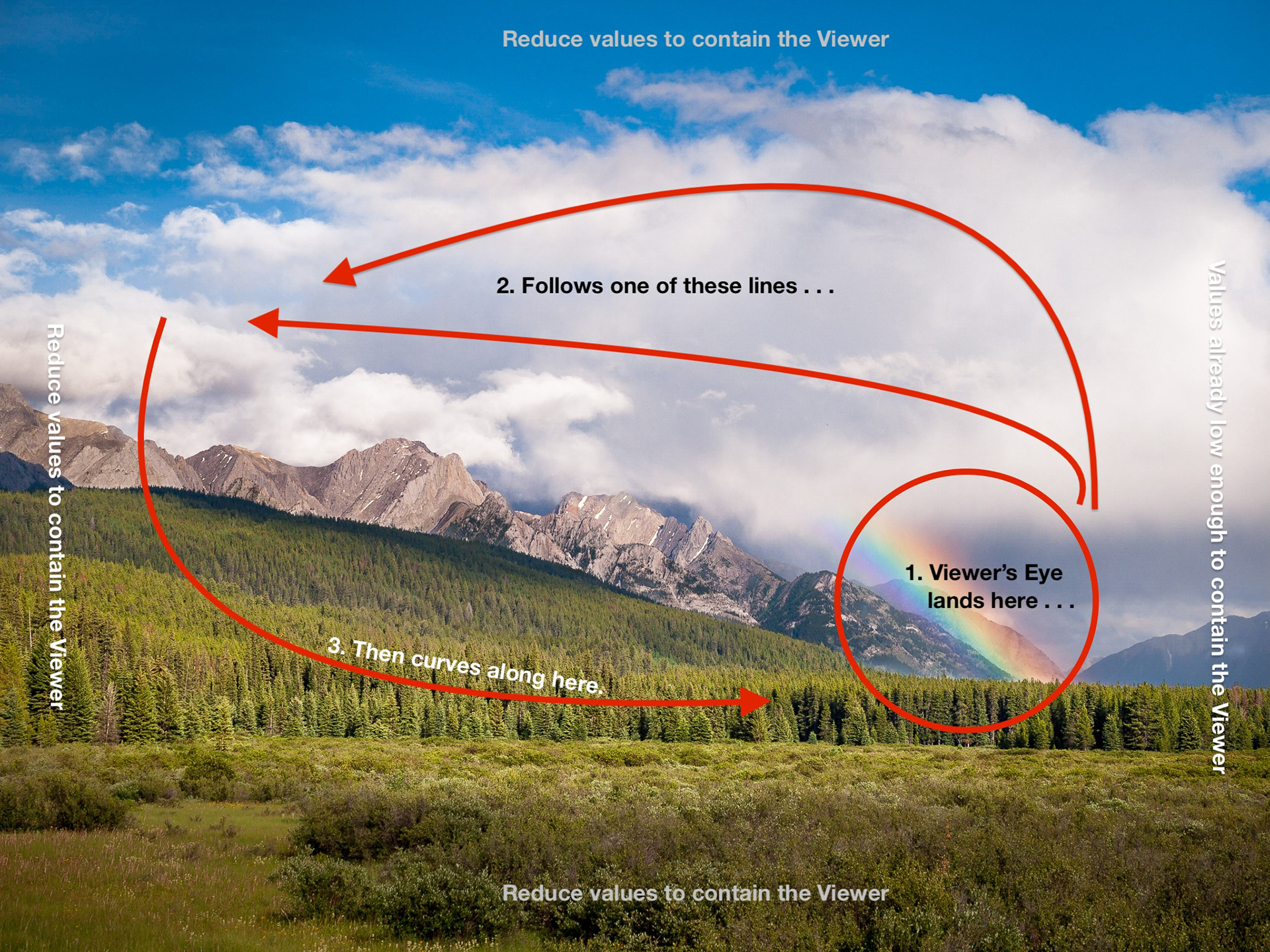
Knowing how viewers subliminally examine images helps with shaping the image using masks.
The other four masks were, what I call 'clean-up' masks, all Linear Gradients. I had a problem with lens vignetting in the top left and right, which became more pronounced with the Sky masks (Exposure +0.40). The other two help contain the ‘Viewer's Eye: (a) lowered the tonal value of the blue of the sky above the clouds (Exposure –0.40; Contrast +30); and (b) slightly reduced the brightness along the left edge of the image (Exposure –0.20).
Containing the Viewer's Eye is an essential part of making photographs, especially prints. It's a carry-over from the darkroom days that many new to digital photography may not be aware of. Without subliminal guidance, the viewer's eye will roam all over the photograph and out of it, if not contained.
Typically the Viewer's Eye lands on the either the brightest point of the photo OR the most visually captivating, like a person or face. In this case, it is likely the rainbow that catches their attention (see 1). From there, the eye wanders up into the clouds counterclockwise, along the mountain ridge (2). It is contained from drifting upwards and out by the subtle application of Linear Gradient masks. From there, the Viewer's Eye drifts down and across, following the brightness of the trees (3) until it arrives back at the beginning. It is contained from drifting out the bottom by a subtle Linear Gradient mask.
Normally, this is done using an Effect called Vignetting by adding –10 to –20, but this scene was too complicated for a simple vignette..
SCREEN: Final Assessment
As with any creative endeavour, it is helpful to put your work away for a while (days to weeks) to let it 'digest'. It is easy to get caught up in the moment which often results in overdoing it. Upon opening this image some weeks later, I found it a bit contrasty. Reducing the overall Contrast from +5 to –15 resulted in a more refined final image, dramatic, without being harsh.
Thanks for reading!
If you’ve found this edition of Field & Screen helpful, or if you have any comments, questions or suggestions, drop me note: terry [at] luxborealis.com
Links open in new tab/window:
Moose Meadows, Banff: 51.2540996,-115.8680907; Google Maps
Morant's Curve location: 51.399568, -116.127198; Google Maps; OpenStreetMap
About Morant's Curve
The Story of Nicholas Morant, CP Rail photographer in the early part of the 20th century
Other images made the same day
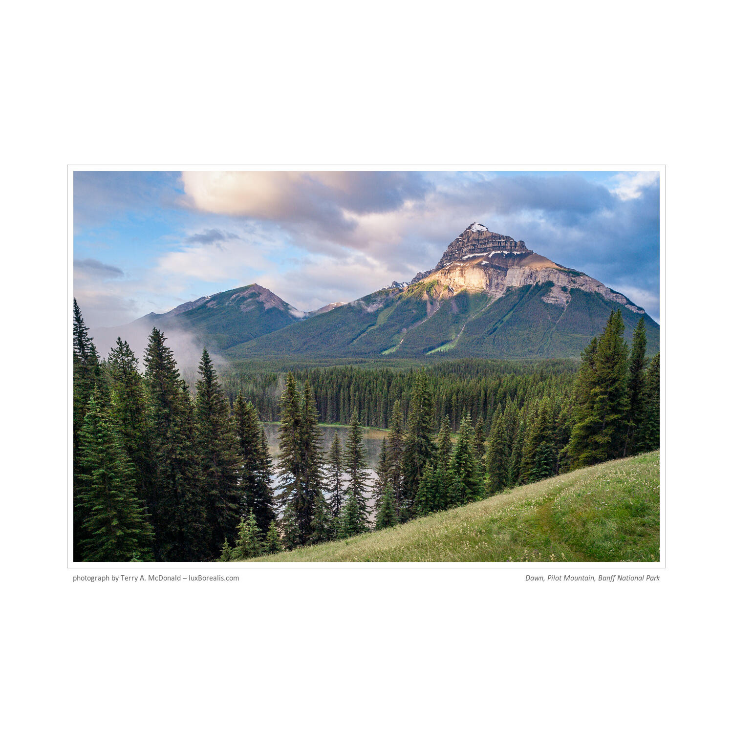
6:32am, Dawn, Pilot Mountain, Banff National Park, Canada
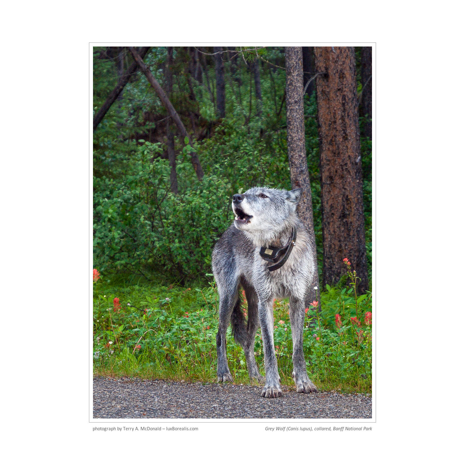
7:59am, Grey Wolf (Canis lupus), collared, Banff National Park, Canada
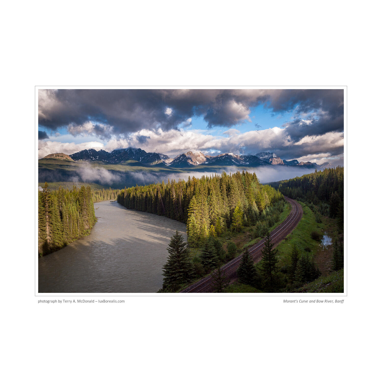
7:33am, Morant’s Curve, Banff National Park, Canada
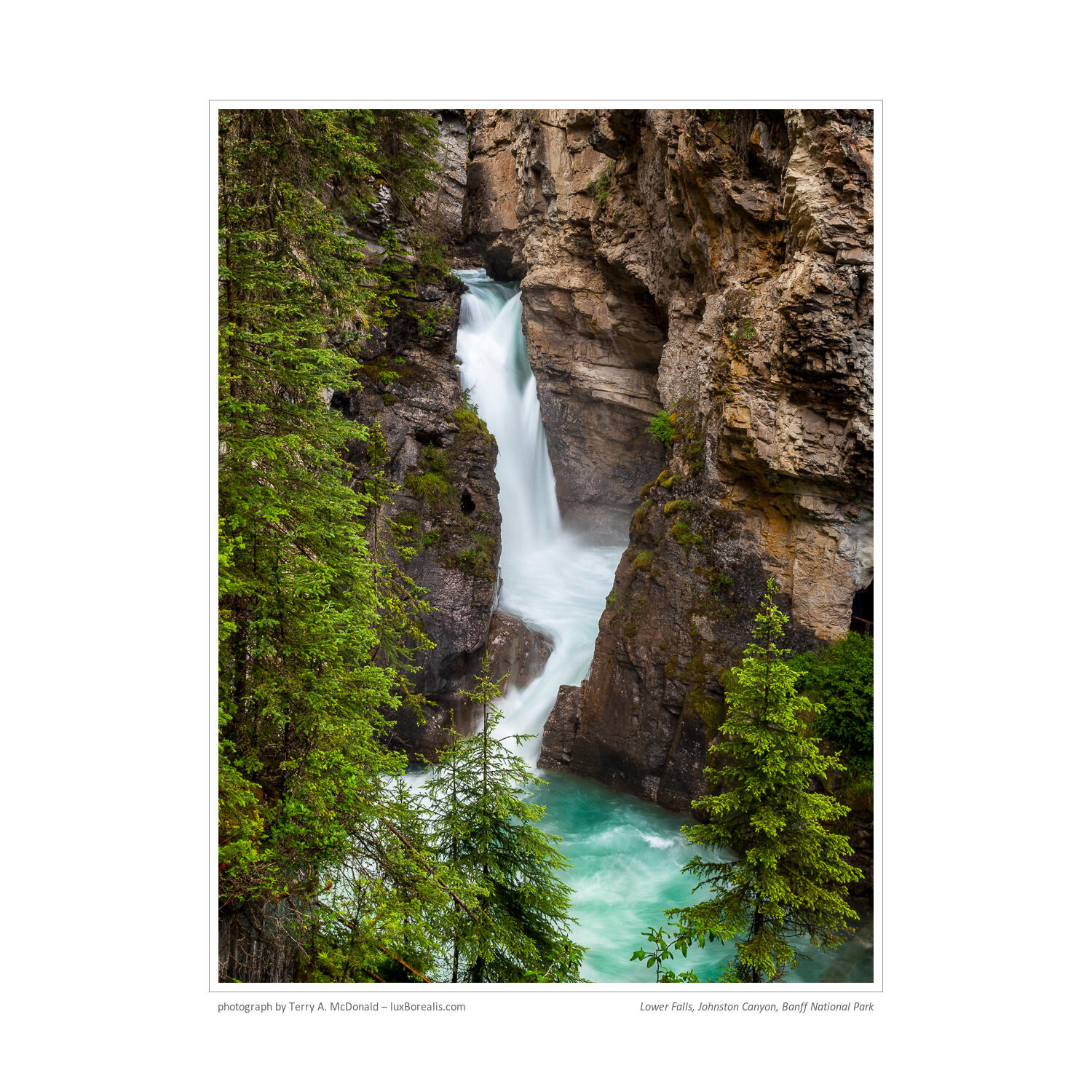
11:10am, Lower Falls, Johnston Canyon, Banff National Park, Canada
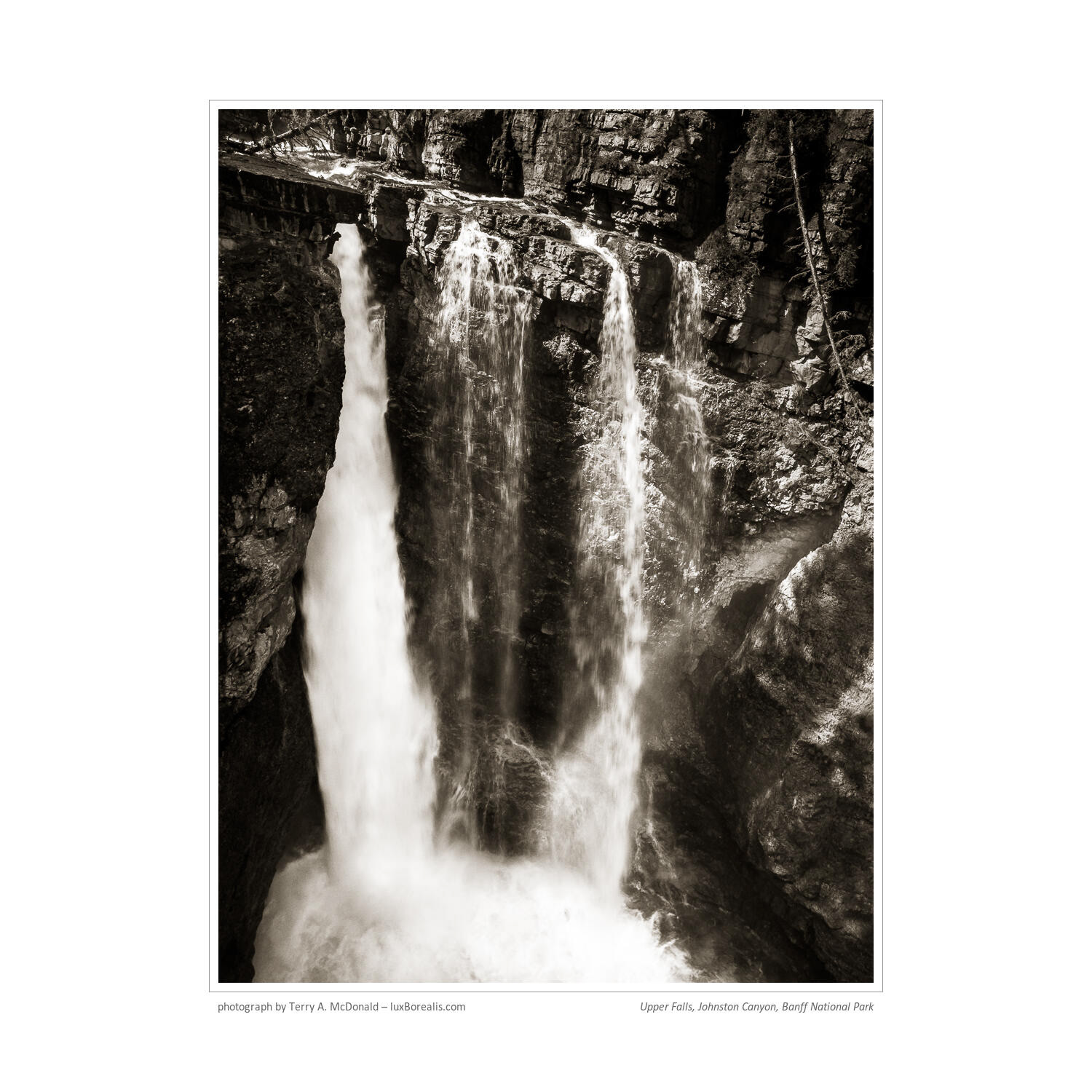
3:49pm, Upper Falls, Johnston Canyon, Banff National Park, Canada
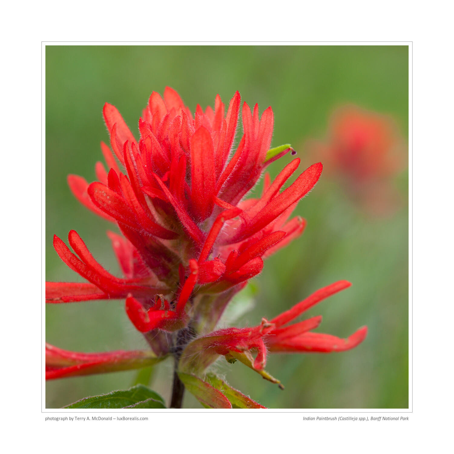
7:42pm, Prairie Fire (Castilleja spp.), Banff National Park, Canada